
On The Line: How Schooling, Housing, and Civil Rights Shaped Hartford and its Suburbs
by Jack Dougherty and contributors, Trinity College, Hartford
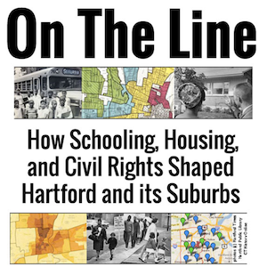
On the Line is an open-access textbook from Trinity College that examines the effects of redlining, town borders, school district boundaries, and more in shaping the Hartford region.
Redlining
"'Redlining' is the discriminatory practice by banks or other financial institutions of denying or avoiding providing credit services to consumers because of the racial or ethnic demographics of the neighborhood in which the consumer lives."
 Redlining gets its name from "residential security" maps drawn by agents of the Home Owners Loan Corporation, a federal agency, between 1933 and 1940. On these maps neighborhoods would be grouped into four color-coded categories, with highly desirable neighborhoods shaded green and the least desirable neighborhoods shaded red.
HOLC agents very often made decisions on neighborhoods based on race, class, and ethnic composition. Financial institutions would use this information to decide who was a good lending risk; people from the "redlined" neighborhoods were considered too risky to loan to simply because of where they lived.
In the map to the right, created in 1937 by HOLC and available online through Mapping Inequality: Redlining in New Deal America, the red neighborhoods were home to the city's Black community and recent immigrants to the United States--mainly Italian and Polish.
Redlining contributed to racial segregation and concentrations of urban poverty, among many other problems. The legacy of redlining is visible in cities all across the United States to this day.
Redlining Maps Online
Mapping Inequality: Redlining in New Deal America is an interactive map created through a collaboration between four universities. Warning: most maps include comments about each neighborhood from HOLC agents--many using language we would find offensive and racist today.
The project includes maps for several Connecticut cities and towns, including Hartford, New Haven, Waterbury, New Britain, Darien, and Stamford.

Zoning is how cities and towns all across the United States regulate land use. In Connecticut, every city, town, and borough has their own regulations. Some activists are now claiming that zoning laws in wealthier towns are deliberately exclusionary, and that requirements like minimum lot size and prohibitions on multi-family housing discriminate against people of color.
The group DesegregateCT has created a zoning atlas that shows all of the different zones in the state at once, and allows users to sort by housing type.
